Plan
Our first move was a team charter, where we discussed strengths, weaknesses, & responsibilities. For this sprint we then laid out a project plan to keep us on task through these 2 weeks.
Competitive Analysis:
Comparative Analysis:
- FitBit
- Apple Health
- FitnessPal (all mobile health apps)
Other unique comparators constantly successful at personalization:
- Candy Crush
- Facebook (social sites)
All these competitors and comparators provide calming - welcoming content, have simpler interfaces, and provide clear navigation. They also emphasize on healthy living and wellness.
Having a healthy lifestyle is becoming more and more important to society. People are tracking diets, exercise, medication, personal symptoms and more with new technology. There are obviously hundreds of mobile apps as competitors to WebMD in this way. With the access and creation of so many apps users are often overwhelmed by choice and little integration between. WebMD could potentially to fill this gap.
Contextual Inquiry
The team observed 6 users interacting with the current WebMD site.
Key Takeaways:
- Overwhelming homepage prompting immediate dissatisfaction.
- Content is inconsistent across pages & often irrelevant to what users are seeking.
- Massive search results (200+) making it difficult & time-consuming to find answers to simple questions.
- MyWebMD account is difficult to discover.
- The current personal account feature.
Business Analysis
Key points to know about the business side of WebMD :
- They are the lead provider of health information, decision-support, and news.
- Revenue Model
- Advertising & Pharmaceutical Company Sponsors
- Legal Considerations:
- Medical Records - HIPAA & Privacy Rule
- Medical Advice - Unauthorized practice of medicine
User Research
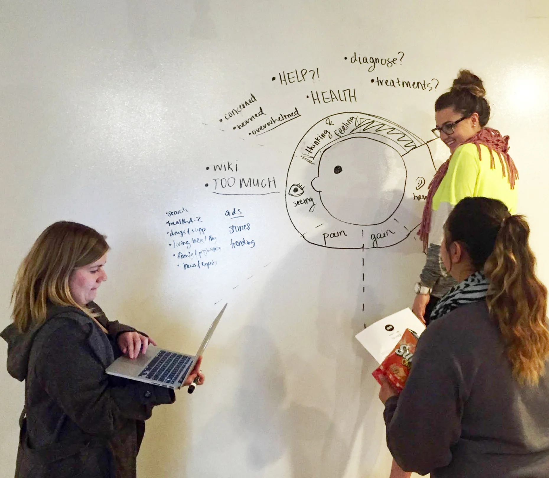
- Empathy Map
- Affinity Map
- Usability Tests
- Interviews
- Survey
Key Findings from Surveys & Interviews:
People are seeking actionable insights to guide them further; not definite answers.
People decide what to do with this health information based on:
- Urgency of symptom
- Complexity of medical history
- Past experience/knowledge
- Overall health philosophy
NOTE - If I could have gone back I would have done more contextual inquiries and interviews within different environments like hospitals and gyms. We were short on time, but I would have gone back out with the information found in #2 and planned another round of surveying and interviewing. I feel it would have made an even better impact on our design.
Personas
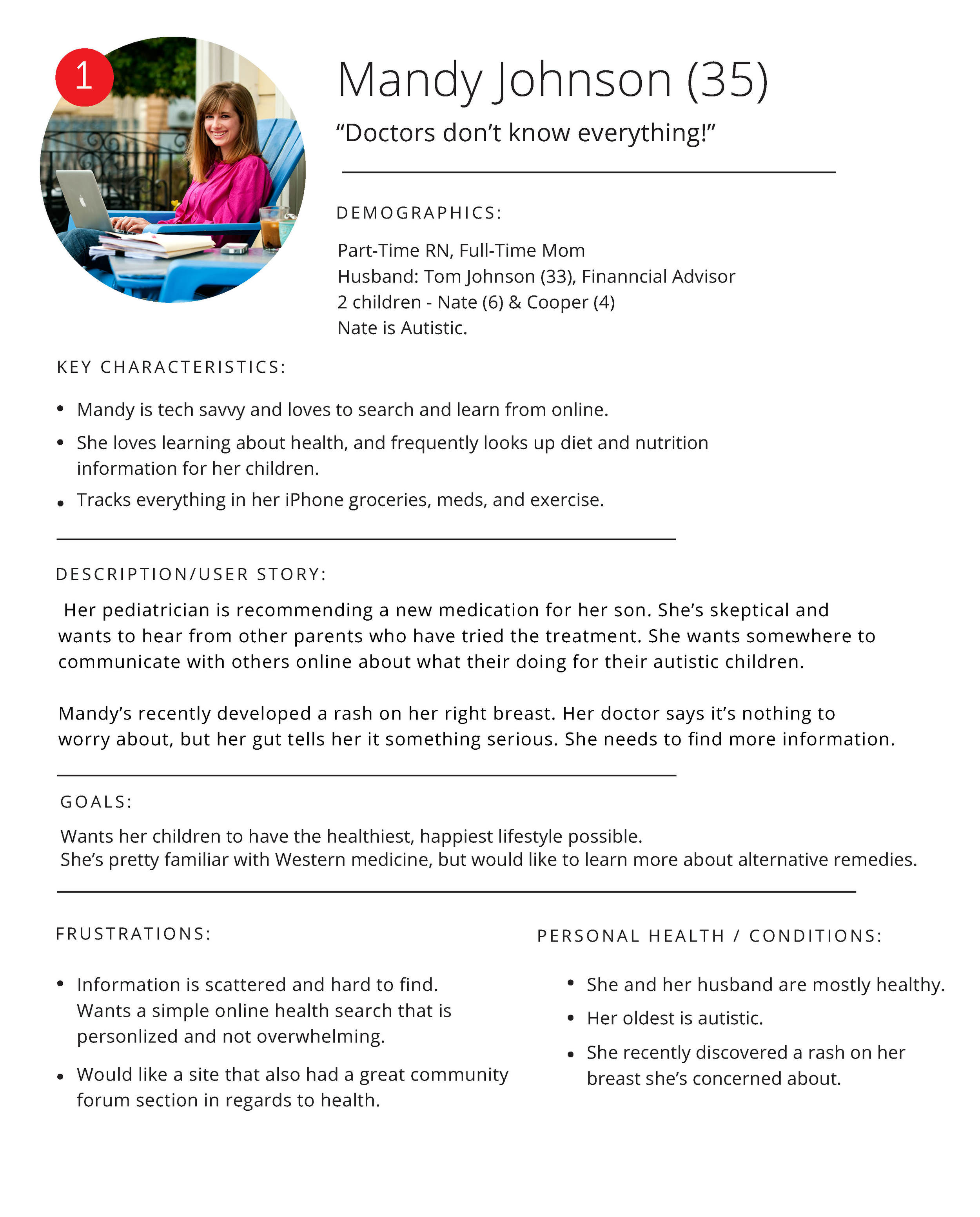


After in-depth research on “real life” scenarios that every human is all too familiar with, we created three personas to guide us through the next parts of our design.
If you’re reading this you probably already guessed it, but the word OVERWHELM was heard, said and written down way too many times. This was a challenge given to us at school, but this was a challenge based on REAL problems and our work could make a real difference.
Based on our key persona Abby’s scenario we created her customer journey.
With her user flow we could easily discover kinks in our redesigns and correct them for a more intuitive personal experience.
Data Synthesis & Priorities
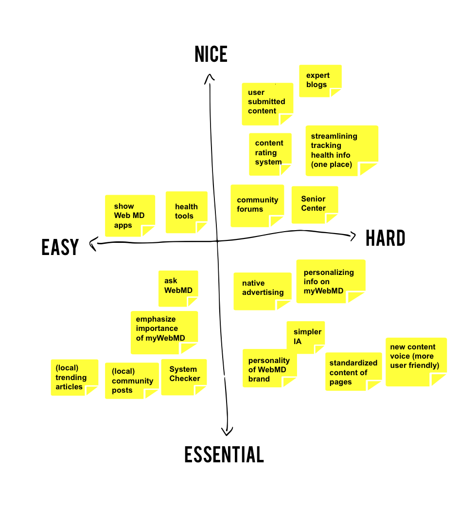
After research we now know we need to create a mobile-responsive desktop site that incorporates the following :
Feature Prioritization Map based on our research thus far.
Highlight myWebMD profile account
Welcoming, calming homepage
Focus on Healthy Living
Standardize & simplify content
Further emphasize personal voice throughout the site
Increase trust in WebMD brand
Ideation & Sketching
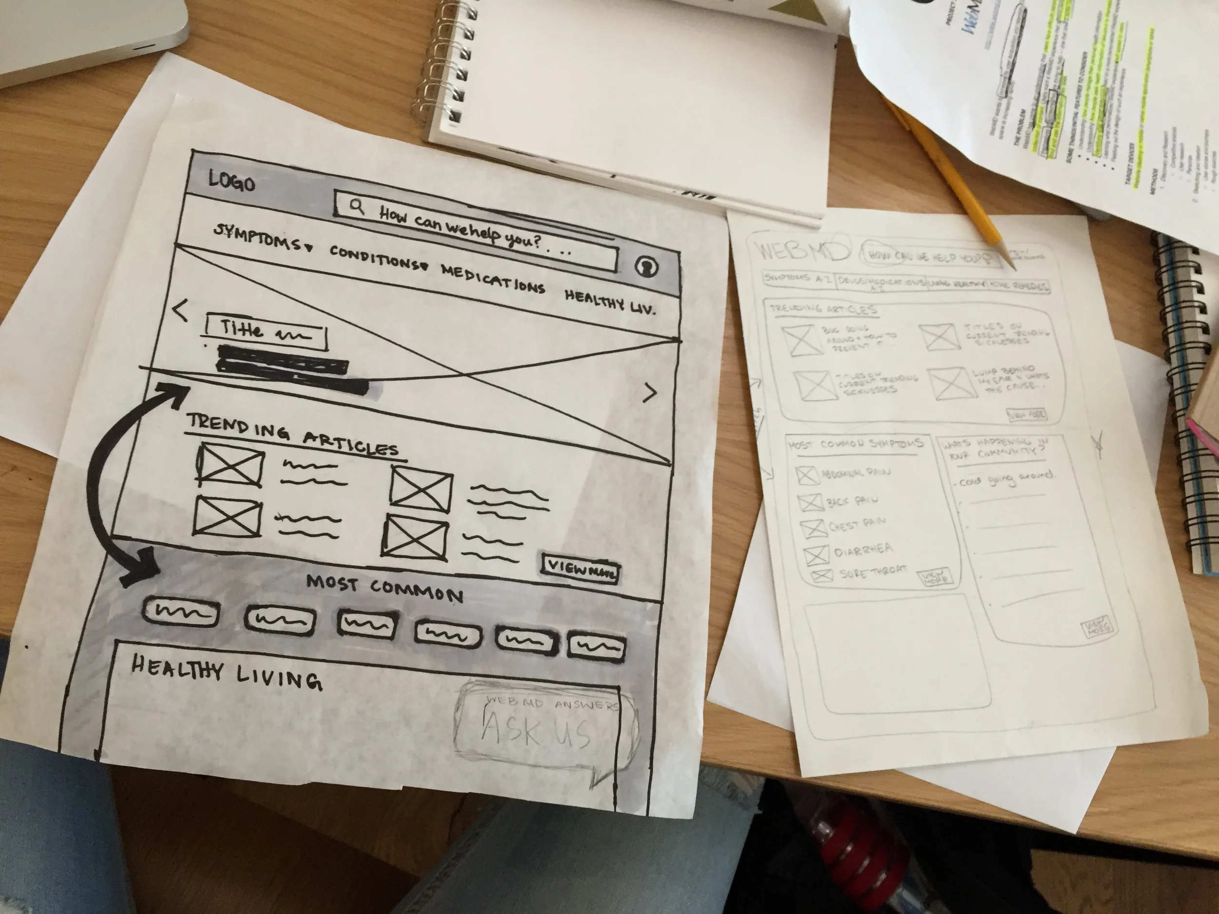
Some of our many lo-fi wireframe sketches
